Validation of User Input
In order to be able to specify more precisely which input values are desired, Ember provides some easy-to-use helpers.
With those, editable input fields can be flexibly customized by the Admin. In the following you will be shown some examples of how to include them into your configuration files.
Some of the following input validation helpers are available as ContentManager_Details_InputValidation.PAR file in the PAR_examples folder of the delivered DPE software package.
Mandatory Field
Code
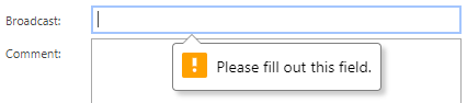
{{input value=editModel.Broadcast type="text" required=true}}Requires to enter any value.
Disabled Field
Code
{{input value=editModel.Broadcast type="text" disabled=true}}Will not allow you to modify the value.
Set Placeholders
Code
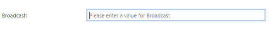
{{input value=editModel.Broadcast type="text" placeholder="Please enter a value for Broadcast"}}Allows you to describe what the input is looking for.
Define a Minimum/Maximum value and create a range

Code
{{input value=editModel.Broadcast type="range" min="0" max="10"}}Creates a sliding tool to enter a value from 0-10.
Limit the input by steps
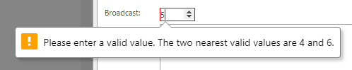
Code
{{input value=editModel.Broadcast type="number" min="0" max="50" step="2"}}Allows only numbers in steps of five.
Allow only customized patterns
Example 1:
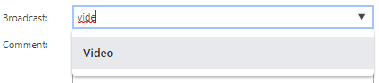
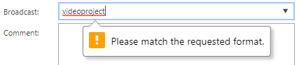
Code
{{input value=editModel.Broadcast type="text" pattern="[Vv]ideo|[Aa]udio|[Tt]ext" list="broadcastList"}}
<datalist id="broadcastList">
	<option>Video</option>
	<option>Audio</option>
	<option>Text</option>
</datalist>
"pattern" only allows “Video”, “Audio” and “Text” as value. Case insensitive.
Example 2:
Code
{{input value=editModel.Broadcast type="text" pattern="[0-9]+"}}Only positive integers are allowed.
Example 3:
Code
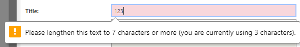
{{input value=editModel.Broadcast type="text" pattern="(?=.*\d)(?=.*[a-z])(?=.*[A-Z]).{8,}"}}Input value must contain at least one number and one uppercase and lowercase letter, and at least 8 or more characters.
How to configure the styling of an invalid input
In order to configure the :invalid condition, you can add <style> tags in the beginning of your template and fill it with your customized CSS-Code.
Code
<style>
    input:invalid {
		background-color: #F8D8DD;
	}
</style>