UI Schemes
About UI Schemes
Since v7 all color and other UI appearance parameters are bundled in so-called UI Schemes. These schemes can be switched completely by a user option in MTE's View menu.
UI Schemes do not include any user defined parameters.
UI parameters of former MTE versions completely moved into UI Schemes (this includes ColorSets and older parameters). This means older MTE versions can run with their own colors while v7 MTEs run with new color, for which new defaults are applied, which are composed in their relation.
Multiple Scheme Parameters
Each scheme is bundled in one specific parameter folder (section). Control over available and current folder is defined by these parameters located in <Editor>\Settings:
| Parameter name | Description |
|---|---|
| UIScheme_current | Defines the currently active UI Scheme (user option) Default entry: UIScheme_dark |
| UISchemes_available | Defines a list of available UI Schemes The list consists of pairs with scheme parameter folder name and display name, separated by a = symbols. List entries are separated by | symbols. Default entry: UIScheme_dark=dark | UIScheme_light=light |
On first startup of MTE v7 a dark and a light scheme are generated in user parameters with default values.
Parameters of one Scheme
Naming Conventions
There's some conventions for naming parameters inside a scheme. These are no hard rules, but more likely nice to have conventions. Anyway this helps guessing or finding a parameter and naming new ones.
- All color parameters are prefixed “Color_”.
- All parameters applying to a type of UI element begin with the type (e.g. “Color_”), followed by the UI element type and underscore (e.g. “Color_Tab_Inactive”).
- All parameters applying to special instances of a UI elements begin with the type (e.g. “Color_”), followed by the UI element type and the special instance without underscore (e.g. “Color_TabEasyTrack”).
- Very specific parameters use the type prefix followed by the specific element (e.g. “Color_VUMeterPhaseIndicator”).
- Different states or variants of an element can be distinguished by a prefix with underscore and the state (e.g. “Color_Text_InverseDimmed”). Combinations usually leave one underscore (e.g. “Color_Button_Def_SymbolChecked”).
Scheme Parameters
Annotations
- Button "shape" means the surface behind the button's symbol graphics.
- Button "shape mask" is a background behind the shape, which deals to make a complete coloring and covering of background.
- The format of color values can be any of the ones listed in Color codes in Digas Parameters. Mind that colors with alpha value are only supported where documented in the following table.
- For some parameters alpha values are supported or recommended (noted in the table below). Alpha means an opacity value in addition to a color. Use web standard rgba(r, g, b, a) syntax, where a is a floating point value between 0 (completely transparent) and 1 (completely opaque). If there is a rgb value configured where a rgba would be supported, the default value is applied as if there would be no entry.
Each scheme is located in one parameter folder, which is located below <Editor>\Settings. The content of this folder is this set of parameters:
Parameter | Element | State / Sub-Item / Description |
|---|---|---|
| Color_Button_Def_ShapeMaskHover | Round buttons | Default for shape mask in hover state (usually black or white with alpha) |
Color_Button_Def_SymbolChecked | Round buttons | Default for checked symbol |
Color_Button_Def_SymbolChecked_Deviating | Round buttons | Default for checked symbol where checked shape is deviating from standard (usually applied to the buttons with special color) |
Color_Button_Def_SymbolCheckedDisabled | Round buttons | Default for symbol when checked and disabled at the same time |
Color_Button_Def_SymbolNormal | Round buttons | Default for symbol |
| Color_Button_DisabledSymbol | Round buttons | Color for disabled symbol (usually black or white with alpha) |
Color_Button_ShapelessHover_Blend | Flat buttons | While hovering: Color to blend with background (usually black or white with alpha) |
Color_Button_ShapelessPushed_Blend | Flat buttons | While pushed: Color to blend with background (usually black or white with alpha) |
| Color_Button_ShapeNormal | Round buttons | Default for shape mask in normal state (usually black or white with alpha or neutral white with 100% alpha) |
Color_Button_Toolbar_ShapelessHover_Blend | Toolbar buttons | While hovering: Color to blend with background (usually black or white with alpha) |
Color_Button_Toolbar_ShapelessPushed_Blend | Toolbar buttons | While pushed: Color to blend with background (usually black or white with alpha) |
Color_ButtonEditMode | So-called “Edit display” mode button | Shape (usually a color with alpha) |
Color_ButtonEditMode_Selected | So-called “Edit display” mode button | Shape when selected (usually a color with alpha) |
Color_ButtonMute | Mute button | Shape (usually a color with alpha) |
Color_ButtonNormalMode | So-called “Block display” mode button | Shape (usually a color with alpha) |
Color_ButtonNormalMode_Selected | So-called “Block display” mode button | Shape when selected (usually a color with alpha) |
Color_ButtonOnAir | OnAir toolbar button | Background |
Color_ButtonPlay_ShapeSelected | Play button associated buttons (Play from, to, inside, etc.) | Shape while playing (may have an alpha value, otherwise a default alpha of 20% is applied) |
Color_ButtonPlay_Symbol | Play button | Symbol |
Color_ButtonRecSelectTrack | Record select button in track head | Symbol |
Color_ButtonRec_Shape | Record button | Shape while recording (may have an alpha value, otherwise a default alpha of 20% is applied) |
Color_ButtonRec_Symbol | Record button | Symbol when recording is possible |
Color_ButtonResolutionMark | Resolution on marked selection button | Symbol |
Color_ButtonSolo_Mute | Solo button | Shape in mute state because other track is in solo (may have an alpha value, otherwise a default alpha of 20% is applied) |
Color_ButtonSolo_Solo | Solo button | Shape in solo state (may have an alpha value, otherwise a default alpha of 20% is applied) |
Color_ButtonWaveformOffset | Waveform offset button | Shape (may have an alpha value, otherwise a default alpha of 20% is applied) |
Color_Clip_1 .. Color_Clip_n | Clipboard and timeline objects | Color is derived for some circumstances (selection, hover, etc.) Define Color_Clip_1 up to Color_Clip_n in a continuous sequence. The amount of clip colors is limited to 99, but not more than 17 are recommended (limit in color selection menu). |
| Color_DefaultPushButtonTopEdge | Standard buttons in dialogs | Top and left edge of the "default" button |
| Color_DefaultPushButtonBottomEdge | Standard buttons in dialogs | Bottom and right edge of the "default" button |
Color_EffectActive | Track mixer ETS effect buttons | Mark for active effect |
Color_FaderHandle | Faders / Sliders | Drag handle |
Color_FaderSlitAbove | Faders / Sliders | Slit above drag handle |
Color_FaderSlitBelow | Faders / Sliders | Slit below drag handle |
| Color_GreenLevelLine | Timeline | Green level line in audio objects |
| Color_InsertionLine | Overview Track | Marker for insertion point during drag&drop |
| Color_Line_BarBottom | Different bar-like items | Light edges on bottom of elements: Is complemented with the top edge line of the element below, so this is the upper line of a line pair. (Color with alpha) |
| Color_Line_BarTop | Different bar-like items | Light edges on top of elements: See note for Color_Line_BarBottom. (Color with alpha) |
| Color_Line_ButtonSeparator | "Hair lines" between flat buttons | |
Color_Line_Divider | Divider lines | Lines dividing flat buttons and menu entries |
Color_Line_SunkenEdgeBottom | “Hair lines” | Visually sunken element’s bottom and right side |
Color_Line_SunkenEdgeTop | “Hair lines” | Visually sunken element’s top and left side |
Color_Menu_BkgndHighlighted | Main menu | Background of main menu's sub menu entry which is being hovered |
Color_Menu_BkgndStandard | Main menu | Background of main menu's sub menus which open interactively |
Color_Menu_CheckmarkBkgnd | Main menu | Checkmark’s background |
Color_Menu_CheckmarkBkgndHighlighted | Main menu | Checkmark’s background while hovering |
| Color_RedLevelLine | Timeline | Red level line in audio objects |
Color_Scrollbar_ArrowBackground | Scrollbars | Background of scroll arrow item |
Color_Scrollbar_Background | Scrollbars | Background of scroll area |
Color_Scrollbar_Edge | Scrollbars | Edge lines |
Color_Scrollbar_Thumb | Scrollbars | Drag handle |
Color_Scrollbar_ThumbBottomEdge | Scrollbars | Drag handle’s bottom and right edge |
Color_Scrollbar_ThumbTopEdge | Scrollbars | Drag handle’s top and left edge |
| Color_SelectedObject_Bkgnd | MultiTrack and EasyTrack screens, Fade dialog | Background color of selected track object (can be specified as RGBA) New since version 7.11.1791.0 |
Color_Soundhead | Soundhead | |
Color_Soundhead | Soundhead | |
Color_Sphere_A | Multiple elements | See below |
Color_Sphere_B | Multiple elements | See below |
Color_Sphere_C | Multiple elements | See below |
Color_Sphere_D | Multiple elements | See below |
Color_Sphere_E | Multiple elements | See below |
Color_Tab_Inactive | Tab controls | Tabs currently not open |
Color_TabEasyTrack | Screen selection tab for ETS | |
Color_TabMultiTrack | Screen selection tab for MTS | |
Color_TabOcxDefault | Screen selection tab for OCX | Default applied if OCX doesn’t define its own color |
Color_TabRecordMode | Screen selection tab for RMS | |
Color_TabReporterBox | Screen selection tab for RPS | |
Color_TabSingleTrack | Screen selection tab for STS | |
Color_Text_Dimmed | Text | Dimmed down text elements |
Color_Text_Disabled | Text | Disabled elements |
Color_Text_Highlighted | Text | Highlighted elements (e.g. for hover) |
Color_Text_Inverse | Text | Inverse text color (light – dark) |
Color_Text_InverseDimmed | Text | Inverse dimmed text color (light – dark) |
Color_Text_InverseHighlighted | Text | Inverse highlighted text color (light – dark) |
Color_Text_Standard | Text | |
Color_TextEdit_Bkgnd | Edit controls | Background |
Color_TextEdit_ReadOnlyBkgnd | Edit controls Combo boxes | Background in read-only state |
| Color_TimeCodeButton_Blend | Times Toolbar / Times window buttons | Blending of time buttons in text area (usually black or white with alpha) |
Color_TimeSelection_Border | Timeline mark in / out | Border lines (color with alpha) |
Color_TimeSelection_Edge | Timeline mark in / out | Edge (color with alpha) The time selection area is drawn with a gradient between this and the midpoint color |
Color_TimeSelection_Midpoint | Timeline mark in / out | Midpoint (color with alpha) The time selection area is drawn with a gradient between this and the edge color |
Color_Tooltip_Bkgnd | Tooltips | Background |
Color_Tooltip_Text | Tooltips | Text |
Color_TrackBkgnd_Locked | Track in MTS | Locked state |
| Color_TrackHead_Selected | Track head in MTS | Selected state |
Color_TrackFadeLine | Fade line in track | |
Color_TrackPanLine | Pan line in track | (Pan = balance) |
Color_TrackParameterLine | Parameter line in track | (Effect’s parameter) |
Color_TrackZeroLine | Zero dB line in track | |
Color_VUMeterPhaseIndicator | VU meter | Phase indicator (appears between left and right channel when phase difference is above configured limit) |
Color Spheres
So-called color spheres are defined to collect independent UI elements which are drawn with the same color. These collections are described in the next paragraphs; the screenshots mark all elements in green which are defined by the specific sphere.
Color Sphere A
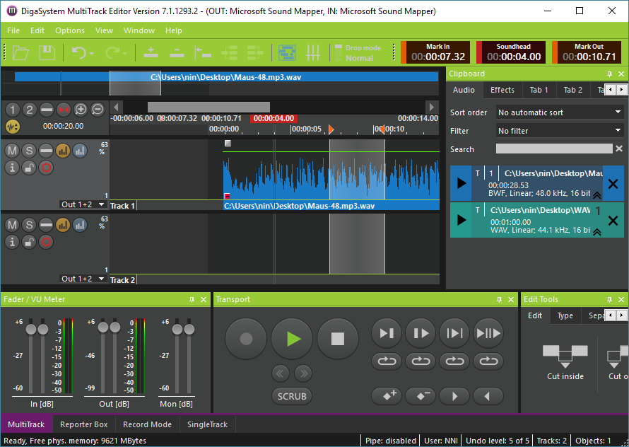
This sphere includes what you see in the picture colored and particularly:
- Non-symbol buttons’ background (mostly in popup windows - not shown in screenshot above)
- Menu bar and toolbar
- Pane captions
Color Sphere B
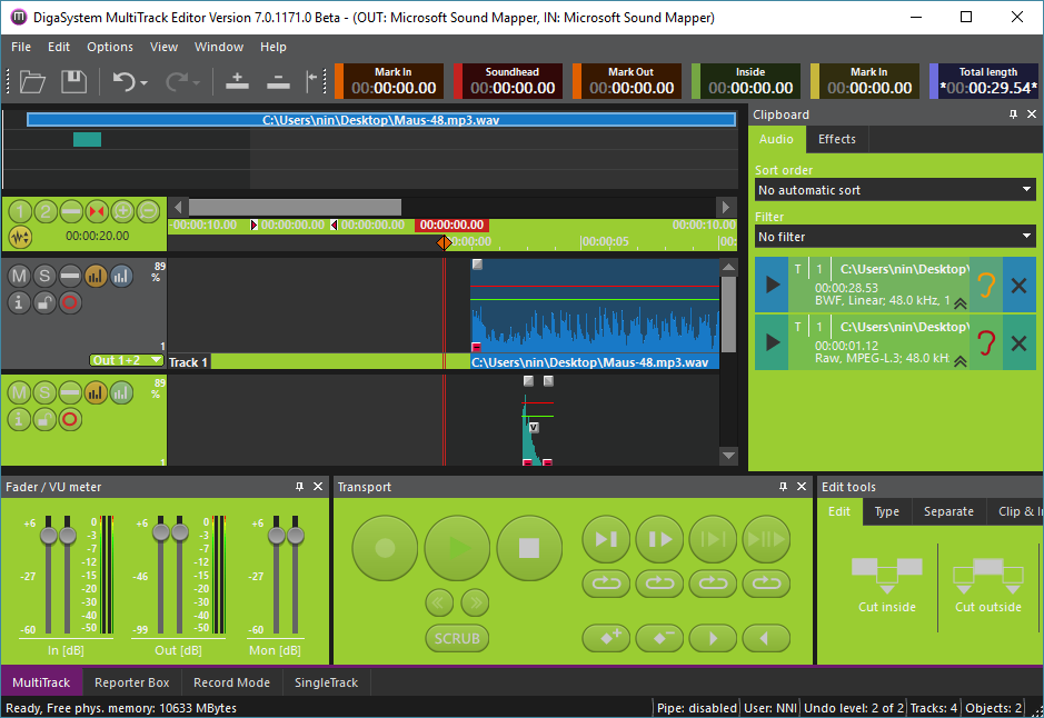
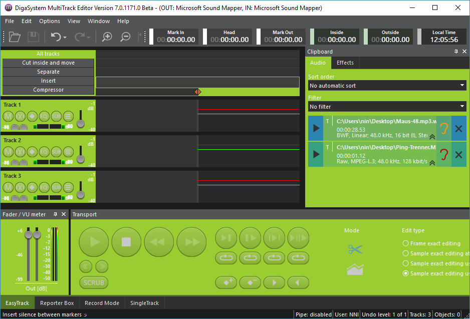
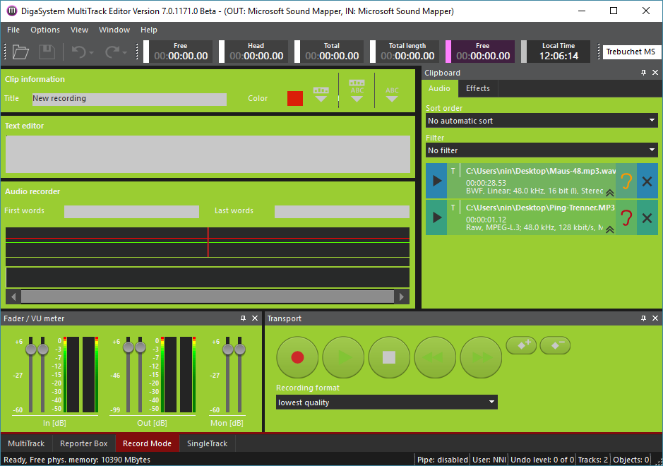
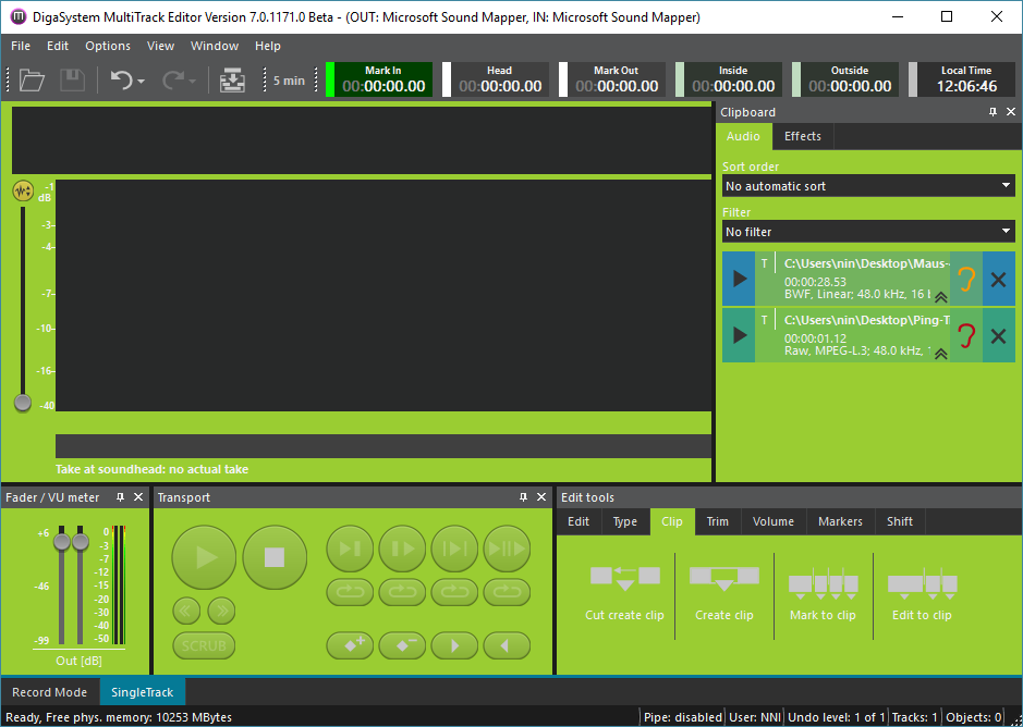
This sphere includes what you see in the picture colored and particularly:
- MTS: Unselected track head
- ETS: Track head
- Popup windows’ background (not shown in screenshot above)
- Panes' background
- Tool areas' background
Color Sphere C
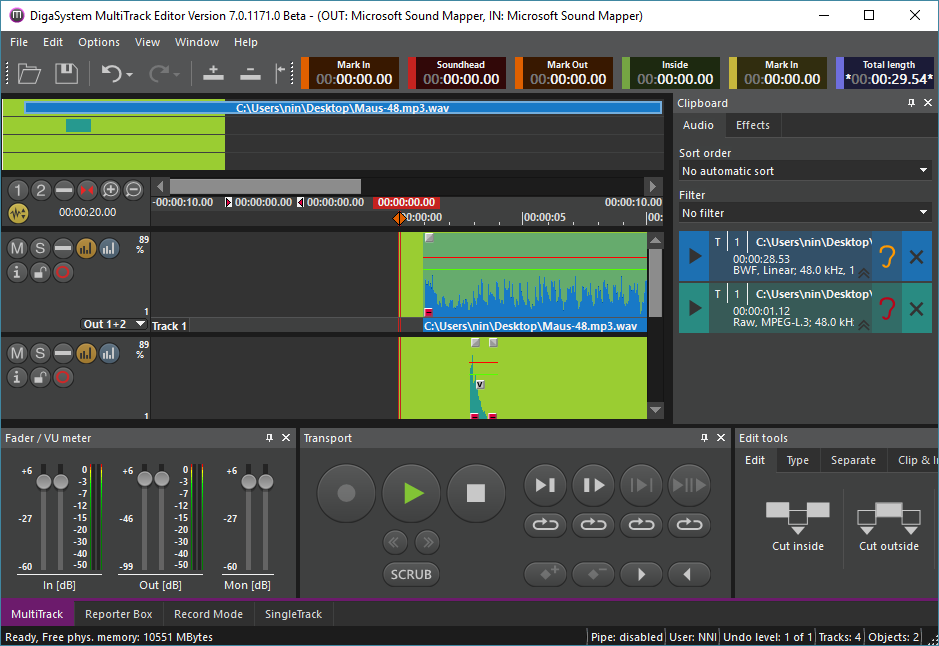
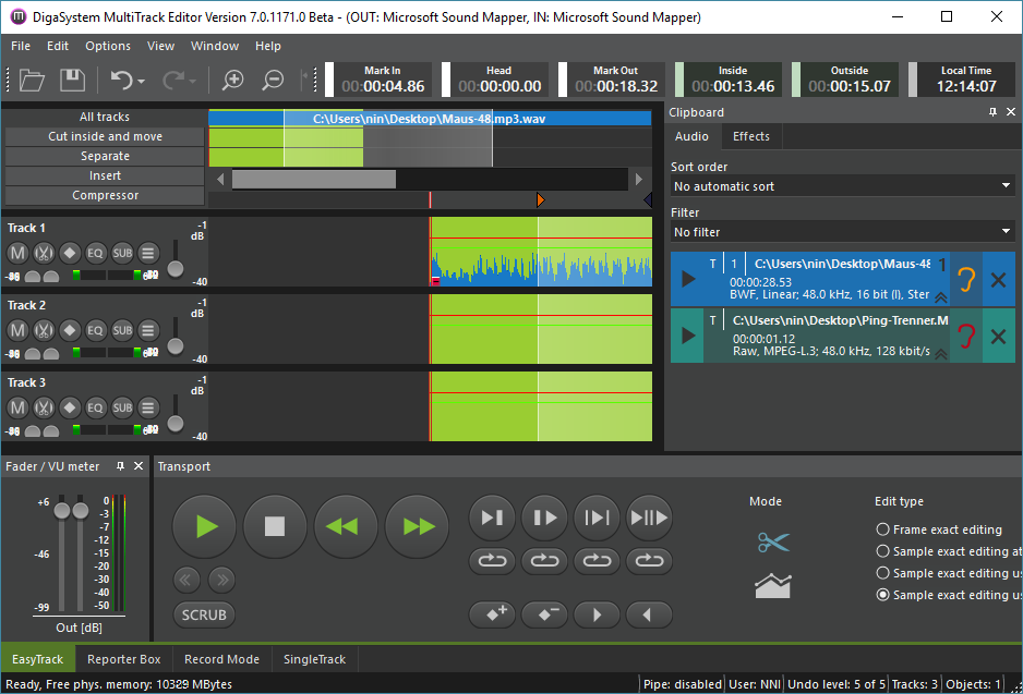
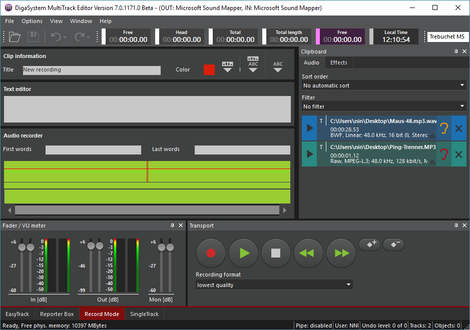
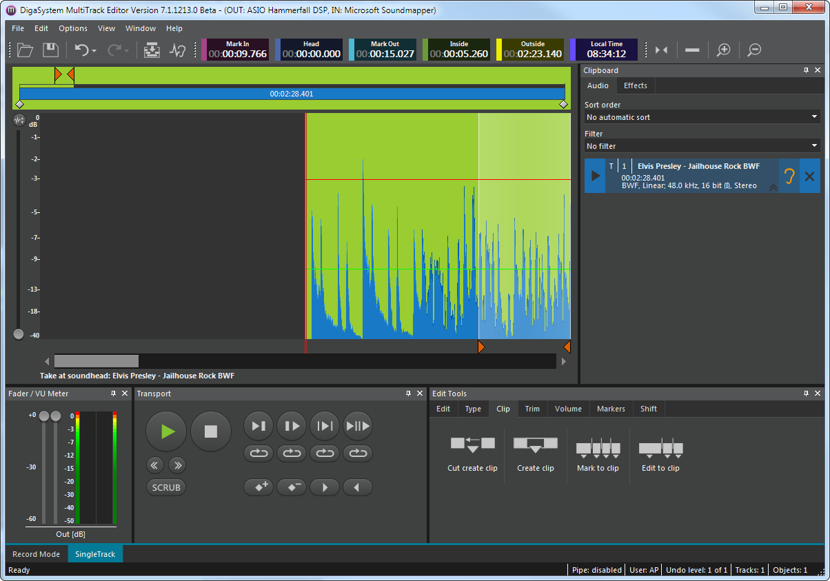
This sphere includes what you see in the picture colored and particularly:
- Timeline's visible part's background
Color Sphere D
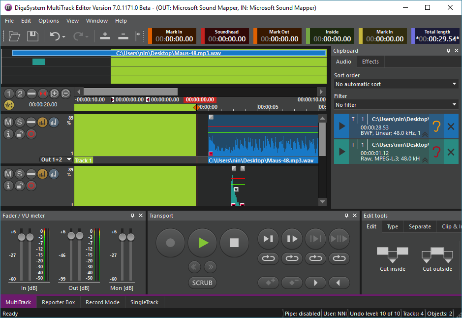
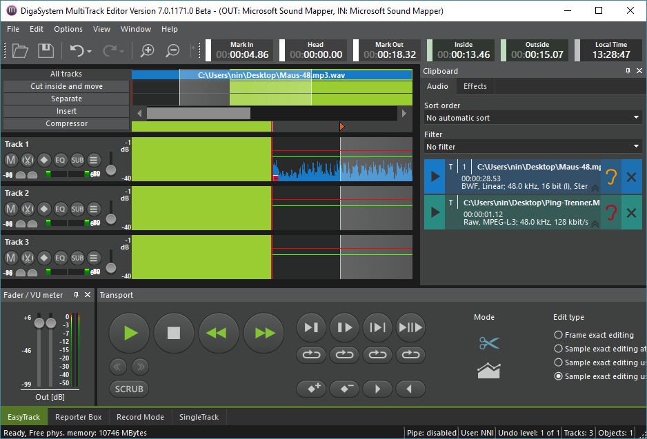
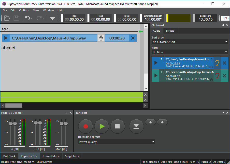
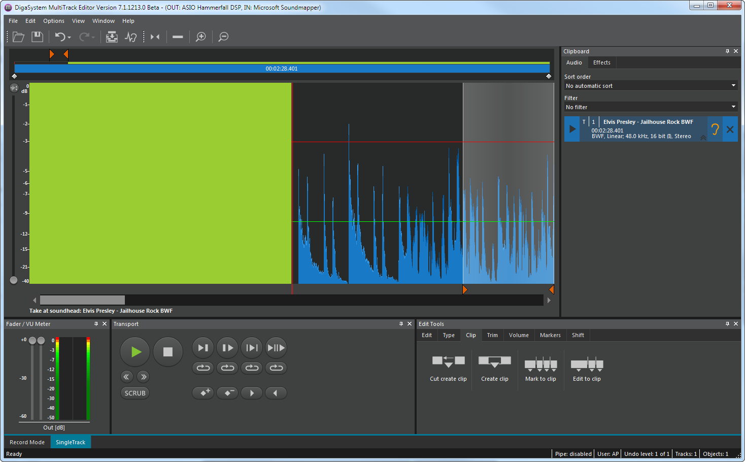
This sphere includes what you see in the picture colored and particularly:
- MTS, ETS, STS: Timeline's invisible and pre-track part's background
- RBS: Timeline's background
Color Sphere E
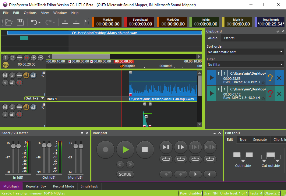
This sphere includes what you see in the picture colored and particularly:
- All screens' surrounding background
- Area between panes
- Status bar's background
