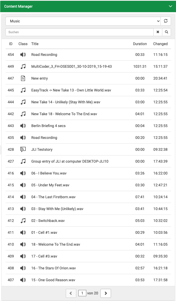
Configuring miniContentManager

The miniContentManager is enabled if configured in the main part of the settings (see: ContentService\\restService on the Main Configuration Settings page). This object allows customization of the miniContentManager on a per page basis.
| Name | Description | Required |
|---|---|---|
defaultFilter Type: String | The default filter as specified in the documentation of Content Manager. Searchable fields: These fields are searched if none specified: | no, default: (empty) |
limit Type: Integer | Set count of entries per page in pagination. | no, default: 100 |
startCollapsed Type: Boolean | Initial collapse state of accordion panel. | no, default: false |
acceptOnlyReady Type: Boolean | Setting true will allow to drag only the elements that have "Ready" state true. | no, default: false |
hideSoftDeleted Type: Boolean | Toggle display of soft deleted elements (deleted virtually but not physically). Note: Requires DPE version 1.13.77 or higher. | no, default: false |
sortBy Type: String | Sort order. Comma-separated list of sort fields. An optional "asc" or "desc" can be added after each field name (separated by space). Examples:
| no, default: "createdate desc" |
columns Type: Array | Array of table columns to query and display in miniCM. Table columns have the order defined in this array. Note: See columns definition below for more information | no |
filters Type: Array | List of pre-set filters. If configured, a selection appears in the user interface. Fields:
Note: The logic operator for filterXML and the filter entered by the user is a conjunction (and). Both filters must return true. Note: The parameter sortBy takes precedence over orderBy. | no |
Example
"contentManager": {
	"defaultFilter": "Album:Hello World",
	"limit": 20,
	"startCollapsed": true,
	"acceptOnlyReady": true,
	"hideSoftDeleted": false,
	"sortBy": "createdate desc",

	"filters": [
		{
			"name": "Class \"Cart\"",
			"filterXML": "<Field Name=\"Class\">Cart</Field>"
		},
		{
			"name": "Sort by Author",
			"filterXML": "",
			"orderBy": "author DESC"
		}
	],

	"columns": [
		"title",
		{
			"name": "class",
			"caption": "Class",
			"type": "icon"
		},
		"author",
		{
			"name": "duration",
			"caption": "Duration",
			"type": "duration"
		},
		{
			"name": "ready",
			"caption": "Ready",
			"type": "icon"
		},
		{
			"name": "perfect",
			"caption": "Perfect",
			"type": "icon"
		}
	]
}
Column definition
In the array of columns, each column is either represented by a plain string or as an object. In case of a string it is used as the field name to query Content Service and capitalized as the column's header. The column's position in the table is defined by the position in the configuration's array.
Example: A value of "author" queries the field "author" and puts "Author" into the column header.
A list of available binding values for columns is provided within documentation of Content Manager.
In case of an object, it must contain three properties. These properties are
- name
- caption and
- type.
Note: While it is possible to query any field from Content Manager it is to note that the values will be displayed as text only. For some fields, like LoudnessEars and LowResExists, this might not be a familiar presentation.
Type
Three types of columns are supported:
icon
date - displayed as YYYY-MM-DD
duration - displayed as mm:ss
- custom format string, according to moment.js documentation
For any other type, the value is printed as a string value without a format applied.
