Configuring Scheduling Page
Configuration of the scheduling page is part of the settings.json, but more complex than a simple parameter. Therefore this chapter covers its details.
The configuration is stored in a nested array of customized Scheduling views under Scheduling\\views. Each entry is an object with the following attributes:
| Name | Description | Required |
|---|---|---|
icon Type: Path as String | Path to icon file of the view Note: It's suggested to use a black-and-white SVG file. | yes |
name Type: String | Name of the view, used as caption on buttons | yes |
schedulingWidth Type: String | Width of the scheduling area in pixels or percentage | no |
showEndpointsFilter Type: Boolean | Displays the Distribution Endpoints filter | no, default: false |
showPrintButton Type: Boolean | Toggle the "Print" button in the show Header | no, default: true |
showOpenButton Type: Boolean | Toggle the "Open Show or Template" button in the show header | no, default: true |
multiTrack Type: Object | Configuration of the multiTrack view. Note: See further documentation below. | yes |
sidePanels Type: Array | Enable side panels Valid values: contentManager, metaData, transitions, rundown | no, default: all enabled |
rundown Type: Object | Configuration of rundown Note: See further documentation below. | no, default: disabled |
toolbar Type: Object | Configuration of toolbar Note: See further documentation below. | no, default: disabled |
contentManager Type: Object | Configuration of Content Manager Note: See further documentation. | no, default: disabled |
Example
"Scheduling\\views": [
    {
        "icon": "custom/Scheduling.svg",
        "name": "Scheduling",
		"schedulingWidth": "60%",
		"sidePanels": ["metaData", "rundown"],
		"showEndpointsFilter": true,
        "tracksFilter": "0,1,110,120,130,1000,2001",

        "multiTrack": {
            "default": false
        },

        "rundown": {
            "columns": "Prelisten, StartMode, Class, StartStopTime, Title"
        },

        "toolbar": [
            {
                "caption": "New Element",
                "type": "element",
				"icon": "fa-regular fa-square-plus",
				"shortcut": ["Shift", "E"],
                "template": {
                    "Title": "New Element",
                    "Time_StartMode": "Manual",
                    "Time_StartType": "Floating"
                }
            },
            {
                "caption": "Schedule Recording",
                "type": "element",
                "template": {
                    "Title": "New Recording",
                    "Class": "Control",
                    "Time_StartMode": "Manual",
                    "Time_StartType": "Floating",
                    "Control_Operation1": "StartRecording",
                    "Control_Reference1": "MarkIn"
                }
            }
        ],

        "contentManager": {
            "defaultFilter": "Album:Hello World",
            "limit": 20,
            "acceptOnlyReady": true,
            "hideSoftDeleted": false,
			"sortBy": "createdate desc"
        }
    }
]
Multi Track
The multiTrack object is used to show tracks side-by-side or as tabs on the Scheduling page. The button to enable it manually is displayed if more than one track is configured.
Its parameters configure the Multi Track view:
| Parameter | Description | Default Value |
|---|---|---|
default Type: Boolean | Set default view state of Multi Track
| false |
In the following example, the Single Track view will be used by default. Scrolling will be linked if the user switches to Multi Track view:
Example
"multiTrack": {
	"default": false
}
Rundown
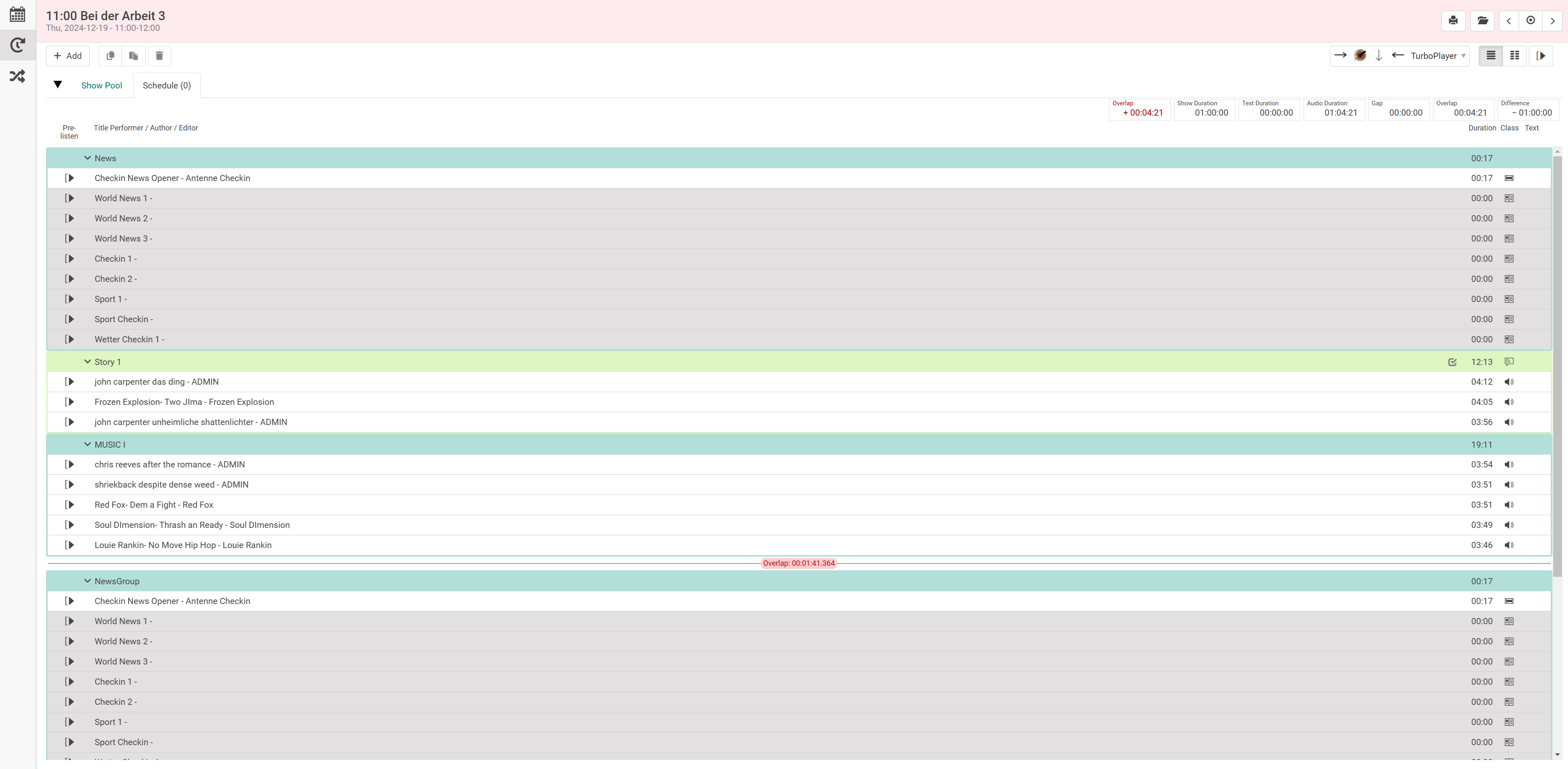
The rundown object is used to configure the main component of the Scheduling page. The table fields can be toggled and ordered.
| Parameter | Description | Default Value |
|---|---|---|
columns Type: CSV as String | Toggle table columns and arrange their order Available column names:
If bundleStartStopTime is disabled, these columns also are available
Note: See chapter Custom Columns for configuration of additional, custom columns. | "StartStopTime, Title" |
bundleStartStopTime Type: Boolean | Stack start and stop time in single column | true |
allowDragDrop Type: Boolean | Toggle drag & drop for groups, stories and elements | true |
dragDropFillWidth Type: Boolean | Set draggable area on nodes to full width or drag helper on the left side
| false |
hideTrackNumber Type: Boolean | Hide the track number | false |
hideColumnsHeader Type: Boolean | Hide the columns header | false |
showGapOverlap Type: Boolean | Displays gap and overlap for the show in the rundown (Displays for current and future shows) | false |
durationsList Type: Array | Available durations as entries to the array
Note:
| ["show", "text", "gapsOverlaps"] |
Example
"rundown": {
	"columns": ["StartMode", "Class", "StartStopTime", "Title"],
	"bundleStartStopTime": false,
	"allowDragDrop": true,
	"dragDropFillWidth": true,
	"hideTrackNumber": false,
	"hideColumnsHeader": false,
	"durationsList": ["gapsOverlaps", "show", "text", "audio", "gaps", "overlaps"],
	"showGapOverlap": false,
},
Custom Columns
In most cases a column is defined by its name only, e.g. Class or Title. Sometimes it is desirable to have full control about the representation of a field or to include custom BCS data. In this case define a custom column as a JSON object inside the array of fields.
Example
"columns": [
	"Title",
	{
		"label": "Event",
		"field": "Event",
		"representation": "icon",
		"icons": {
			"done": "fa fa-check",
			"default": "fa fa-exclamation-triangle"
		},
		"tooltip": "Event"
	},
	"Class"
]
Following is a list of JSON attributes to specify a custom column.
| Property | Description | Type |
|---|---|---|
| label | Label used for header in table | String |
| field | Name of the BCS field | String |
| representation | Display the raw value or convert it to a visual representation (i.e. icon or image). Conversion is done using the icons property, using either an icon font or image URLs (see icons property). | String, valid values: icon, image, string |
| icons | Mapping of content values interpreted based on representation.
| Object |
| size | Width of column specified as a factor of the default width. | Number |
| tooltip | Additional information to display in a tooltip for users. | String |
Toolbar
The toolbar is an array of objects, each representing a menu in the ADD dropdown.
| Name | Description |
|---|---|
caption Type: String | Caption of the button in the toolbar |
type Type: String | Type of the node to be created. Can be any of "Group", "Story", "EndpointStory" or "Element" |
icon Type: String | Icon is displayed before the caption and it can be CSS classes or image. By default a '+' icon is displayed. |
shortcut Type: Object | Shortcut to create the node. Refer to the "shortcut definition syntax" on the Configuring Shortcuts page or the examples below this section. |
template Type: Object | Preset of the node to be created; contains any BCS field. In most applications it is advised to include at least these attributes: "Title": "New Recording",
Note: Custom BCS fields use two underscores instead of a dot (i.e. DEMO__YouTube instead of DEMO.YouTube) |
children Type: Object | An array of objects, each representing the child node(s) of a "group", "story" or "endpointStory" node. The child nodes themselves are then defined by the parameters "type" and "template" again. Note: A "group" cannot contain another "group", a "story" cannot contain another "group" or "story" and an "element" cannot contain any child. Therefore, if the child node itself is of type "story", it can only contain "elements" in its parameter "children". If the child node itself is of type "element", it cannot contain the parameter "children". |
Example
"toolbar": [
	{
    	"caption": "New Element",
    	"type": "element",
		"icon": "fa-regular fa-square-plus",
		"shortcut": ["1"],
    	"template": {
    	    "Title": "New Element",
    	    "Time_StartMode" : "Manual",
    	    "Time_StartType" : "Floating"
    	}
	}
]
Example with children
"toolbar": [
	{
		"caption": "Group + Story + Element",
		"type": "group",
		"icon": "fa-regular fa-square-plus",
		"shortcut": ["2"],
		"template": {
			"Title": "New Group",
			"AllowedClasses": "News,Text,Music,Cart,Commercial,Audio,Magazine,Promotion,Graphic,Video,Story,Live,Line,Info",
			"Time_StartMode" : "Manual",
			"Time_StartType" : "Floating"
		},
		"children": [
			{
				"type": "story",
				"template": {
					"Title": "New Story in Group",
					"AllowedClasses": "News,Text,Music,Cart,Commercial,Audio,Magazine,Promotion,Graphic,Video,Live,Line,Info",
					"Time_StartMode" : "Manual",
					"Time_StartType" : "Floating"
				},
				"children": [
					{
						"type": "element",
						"template": {
							"Title": "New Element in Story",
							"Time_StartMode" : "Manual",
							"Time_StartType" : "Floating"
						}
					}
				]
			}
		]
	}
]