Customize User Interface
The GUI Designer is a powerful tool to customize a WebTurboPlayer layout. Among general settings, components can be added, modified and removed. To access the GUI Designer, add the suffix “/edit” to the URL, like so:
Enter:
http://localhost:8090/#/index/[GuiNumber]/editBasic Logic
Saving Changes
All settings and customizations described in the following sections must be saved by clicking on the save button.
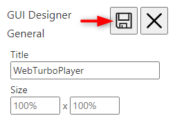
The changes are saved via TurboPlayerService to the Layouts folder.
General
The first section of the GUI Designer configures the page title and size constraints. By default, a WebTurboPlayer layout fills the browser window by 100%, but this can be changed to absolute or relative values, like:
- 50%
- 800px
Note: These numbers are processed in code and must be entered without a space between the number and unit.
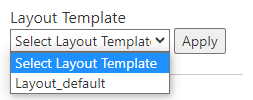
Template Selection
If the TurboPlayerService is set up with templates they will show up in this drop-down menu. When clicked on one of the drop-down options a preview image appears, if it is available. Clicking on Apply sets the layout for the current GUI Number.
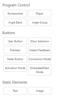
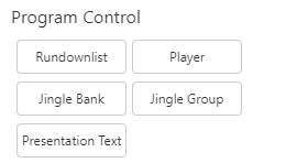
Add Component
Add a component by clicking on the corresponding button in the GUI Designer. The list of components includes program controls, buttons and static elements. Every new component will be placed near the top left corner of the screen. It can then be edited as described in the following section.
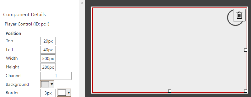
Edit Component
Select a component by clicking on it. This will highlight the component with a red border and open its properties on the left side. Each property has a default value, which can be customized.
To move any component, drag it to its proper position on the screen. It will snap to a grid of 10 pixels, which makes parallel alignment easy. More precise positioning can be done by manually entering the coordinates in the Component Details.
Resizing is done in a similar manner. Each component displays three white rectangles, which are used to drag a dimension. The same grid of 10 pixels is used to snap to; again this can be manually overwritten in the Component Details.
Additionally, each component has individual settings that can be found in the Component Details. These settings are mostly font size and color, background colors and feature toggles. In many cases multiple settings relate to the same feature and are therefore grouped. A black border on the left side indicates a group of properties.
Delete Component
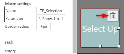
Each component has a trash bin icon in the top right corner. Clicking this deletes the component from the screen and moves it to the Trash.
Components can be easily recovered from the Trash with the “undo” button.
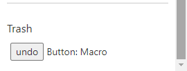
Note: The Trash is emptied as soon as the browser reloads the page!
Components Explained
Presentation Text
Presentation Text is added since version 1.8.286.0 in the group of Program Control. The component Presentation Text may also be referenced as the component to display RTF Content or Moderation Text.
In addition to the shared Position fields, there are the following fields provided to configure the Presentation Text in use.
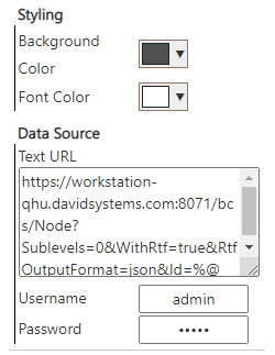
The Background Color and Font Color in Styling group customize the general appearance of Presentation Text. The result can be dark background with light font color or light background with dark font color.
The Text URL, Username and Password fields in Data Source group tell the Presentation Text how to get Presentation / RTF / Moderation text for the selected node which is indicated by the usage of `%@` in the Text URL.
Since currently TurboPlayerService doesn't support Presentation text requests and BCSService supports Presentation Text and it can connect to the same BCS as used by TurboPlayerService, one can use BCSService URL for WebTurboPlayer to get Presentation text. (And it is also possible to develop 3rd party RESTful services other than BCSSerive for WebTurboPlayer to get Presentation Text)
To use new (the version available and newer versions when WebTurboPlayer 1.8.286.0 is released) versions of BCSService for WTP to get Presentation text, one can configure the Text URL as `https://bcss-host/bcs/Node?Sublevels=0&WithRtf=true&RtfOutputFormat=json&Id=%@` which is also provided as the placeholder hint. (using HTTP instead of HTTPS also works if WebTurboPlayer is served in HTTP) And because BCSService has basic authentication, to use BCSService for WebTurboPlayer, one valid Username and Password combination is also necessary.
User Button
A user button can be configured, to trigger macros in TurboPlayer. The following arguments are available:
Title | Displayed text in user button (Example: Select Up) |
| Name | TurboPlayer macro name (Example: TP_Selection) |
Parameter | Parameters which are handed over to TurboPlayer macro. (Example: *, Show, Up, 1) Dynamic parameters:
|
- for available commands and their parameters, query TurboPlayer and TurboPlayerService TechManual
- for macro command TP_ChangeUserButtonProp specifictly, supported property name and value patterns include the following as examples: Background, #0000ff; Top, 100px; Left, 100px; Width, 50px; Height: 100px; Title, "User Button - New Title". (Font is not yet supported)
Instant Feedback
If Instant Feedback is enabled, WebTurboPlayer (WTP) will emulate the playout of TurboPlayer. To do so WTP loads the prelisten files and starts playback at the current timestamp. At the end of an element, it will jump to the next. So the user can listen along to the show, as long as prelisten files exist. The File check task of the BroadcastUtilityServer (BUS) must be configured accordingly in order to create prelisten files.
Text Component
The Text component is able to parse placeholders, which give access to information of the current show. The option “Enable Parser” have to get set to activate this functionality. Placeholders follow a simple pattern:
Enter:
%object.attribute%
%functionName object.attribute parameter%
Currently the only accessible object is CurrentShow. Two examples to illustrate its use:
Enter:
<span>Show Name: %CurrentShow.Name%</span>
<span>Start Time: %format CurrentShow.Time_Start "HH:mm"%</span>
Note that along with parameters the use of HTML is also possible.
Functions
At the moment only one function is implemented.
Function Name | Description | Example |
format | Format a timestamp with moment.js. Possible format values can be taken from its documentation. | %format CurrentShow.Time_Start "HH:mm"% |
Objects
At the moment only one object is implemented.
Object Name | Description | Attributes | Example |
CurrentShow | Refers to the currently loaded show. |
| %CurrentShow.Name% |