Adding editable-custom-field component
If you want to make custom fields available for your users, you have to configure them as part of a Details Pane Template.
After saving a change when editing a custom field,
Beware that if the custom field is not existing in the database, it'll be created.
You cannot remove a custom field from the UI, so make sure you configured the right custom field name.
Full configuration example
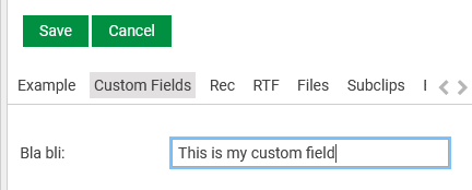
In this example we have included the read-only display and the editable custom field control for custom field named "bla/bli".
The value of customField must contain the "/" (slash) in between its two words. i.e. "bla/bli" is a custom field, "bla-bli" is not a custom field.
Code
{{#form-container legacyController=legacyController}}
    {{#if editable}}
        {{#responsive-grid-area}}
            <div data-col="sm-4 xs-12 valign-sm-center valign-xs-bottom">
				Bla bli:
			</div>
            <div data-col="sm-8 xs-12 valign-center" class="editable-field">
				{{editable-custom-field editable=true model=editModel customField="bla/bli" ariaLabel="Custom Field bla bli"}}
			</div>
        {{/responsive-grid-area}}
    {{else}}
        {{#responsive-grid-area}}
            <div data-col="sm-4 xs-12 valign-sm-center valign-xs-bottom">
				Bla bli:
			</div>
            <div data-col="sm-8 xs-12 valign-center">
				{{editable-custom-field model=model customField="bla/bli"}}
			</div>
        {{/responsive-grid-area}}
    {{/if}}
{{/form-container}}
The default maximum text length that can be entered is 80 characters. Specify a maxlength property if you need another limit.
Example:
{{editable-custom-field editable=true model=editModel maxlength=1000 customField="bla/bli" ariaLabel="Custom Field bla bli"}}Result

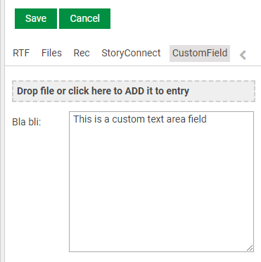
If we want to have a text-area field instead of default input field, we need to add a property "isTextArea=true" to the component.
Code
<div data-col="sm-8 xs-12 valign-center" class="editable-field">
	{{editable-custom-field editable=true model=editModel customField="bla/bli" ariaLabel="Custom Field bla bli" isTextArea=true}}
</div>
Result

